Six months. About time to get back to the blog.
I am taking another mapping class. Of cousre, that's what geography majors do.
I made a map using CartoDB. Not sure how I feel about CartoDB, yet.
For a better view, please select the full screen button in the top left. Apparently, Google products don't communicate with each other very well.
Check it out:
Saturday, November 7, 2015
Tuesday, May 12, 2015
Lab 9: I Melt with You
I've loaded the code, but for some reason, my 'city' column is not recognized and none of my data appears for years other than 1980.
Ive seen the difference and it's geting better all the time...
Monday, May 11, 2015
Lab 8: Popsicles and Icicles
As the weather warms, it's a great time for nice refreshing Leaflet map of Popsicle Sales. I believe there may be a direct connection to global warming here.
http://mason.gmu.edu/~jfelici2/Lab8_Popsicles
http://mason.gmu.edu/~jfelici2/Lab8_Popsicles

Wednesday, April 22, 2015
Lab#4: Train, Train!... Take Me On Outta This Lab!
Where do I begin?...
We start the lab in class. Tweens are kinda cool. I get my animated block done before leaving. Awesome. This will be so much easier than Lab 2.
Yeah. Right.
Crushed. Creative Cloud, you show me no love.
Struggles. Struggles with the simplest of things.
My isolines won't behave. Shoot, Flash won't behave. Definitely some operator error, but c'mon?!
This is the last most coherent shot I can show. Lots of practice files... piles of files...
My block is not visible in that shot and no longer plays as a movie. Much like Lab 2.
We start the lab in class. Tweens are kinda cool. I get my animated block done before leaving. Awesome. This will be so much easier than Lab 2.
Yeah. Right.
Crushed. Creative Cloud, you show me no love.
Struggles. Struggles with the simplest of things.
My isolines won't behave. Shoot, Flash won't behave. Definitely some operator error, but c'mon?!
This is the last most coherent shot I can show. Lots of practice files... piles of files...
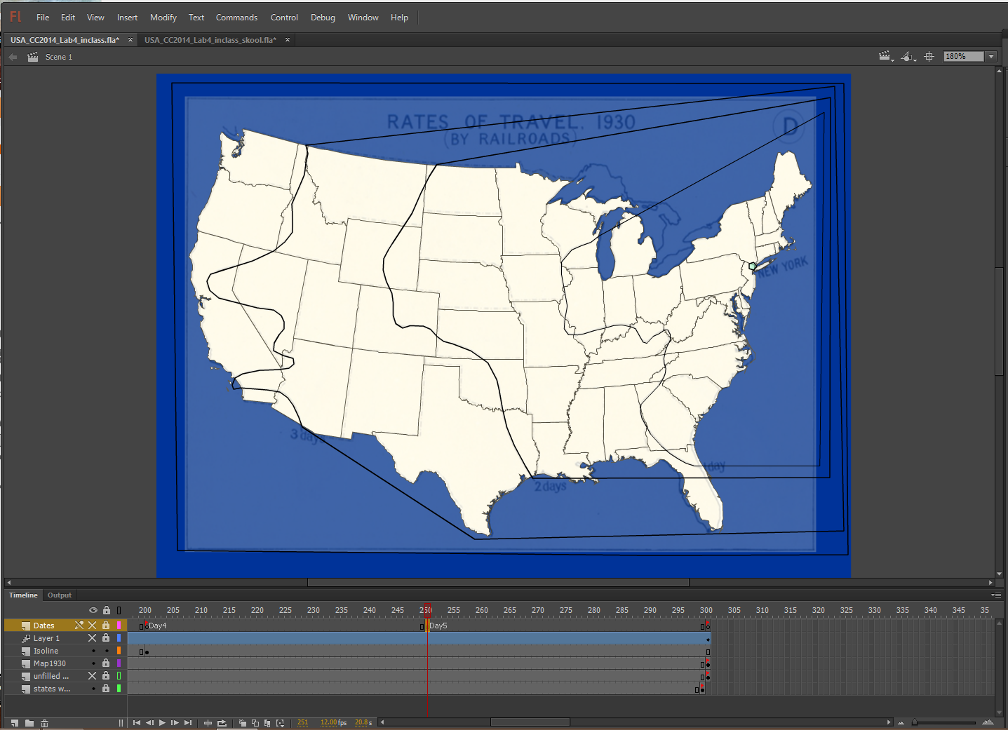 |
| A single shot with most of my work in a single place. Doesn't show the practice files or iterations failures and modest successes. Isolines. A tiny polygon for NYC filled with robin's nest egg blue.Days planned, Keyframes. Journey starts on day zero. Multiple starts and stops over four weeks didn't help. Determined to get this one functional. |
Lab #2: Thank You (Falettinme Hate Mice Elf for Lovin Football Agin)
Because I can't put a link in the post title-
Thank You (Falettinme Hate Mice Elf for Lovin Football Agin)
It's pretty, but it doesn't work. Like a trophy wife. But that's another football post...


Thank You (Falettinme Hate Mice Elf for Lovin Football Agin)
It's pretty, but it doesn't work. Like a trophy wife. But that's another football post...
Ideally, the buttons will not only work, but also make a kick/punt sound forward and a whistle for pause. Those are free sounds. Tackles and "Hut-Hut" cost $.
Prof. Hallden has helped, bu this might need a complete overhaul. Save the artwork and start over. Again.
I feel a bit deflated that this is not yet functional.
Monday, April 20, 2015
Find-A-Map #7- All I Wanna Do Is Zooma Zoom Zoom Zoom
Whales. A Cousteau. and an Obstacle course.
Plus Panning, Zooming, Tweens, and you guessed it... More Buttons!
This map has it all!
Mostly.
The sense of direction and motion can be a little odd here and there, It does not appear to be expandable in size. Which is a shame because that might help with the sensory experience and also the display of additional text and inset content.
Nonetheless it is a fun map and a solid example for the assignment.
http://www.pbs.org/kqed/oceanadventures/episodes/whales/interact/
Plus Panning, Zooming, Tweens, and you guessed it... More Buttons!
This map has it all!
Mostly.
The sense of direction and motion can be a little odd here and there, It does not appear to be expandable in size. Which is a shame because that might help with the sensory experience and also the display of additional text and inset content.
Nonetheless it is a fun map and a solid example for the assignment.
 |
| Have some fun. Hit the back (down) button and watch how the whales swim. The jump to destination comes in handy. These whales have quite a journey. |
http://www.pbs.org/kqed/oceanadventures/episodes/whales/interact/
Find-A-Map #6- That's not a map. This...Is a Map.
Anzac Day.
Look it up. Initially a solemn day of remembrance for Gallipoli. Look that up, too. Or watch the Smithsonian documentary.
It's a day of remembrance; it is not supposed to be a party.
Bad ideas. Bad plans. Bad decisions. Bad days. People died. It was avoidable.
World War One was supposed to be the "War to End All Wars".
This map makes a big splash. Multiple portals to enter. Music. Great choices of content. Excellent touches with background details. Easily and skilfully engages the website visitor. Very impressive. When my map grows up, it wants to be like this map.
I don't want to say much more so as not to influence your experience. The website does have playable and story modes and uses 3D mapping and imagery.
http://www.abc.net.au/innovation/gallipoli/gallipoli2.htm
Find-A-Map #4 and #5- Twin posts for Tweens and Time
Double duty!
This week's post provides some continuity from previous maps and subjects.
Post #4
If you recall, for Find-A-Map #2 one example map portrayed Manifest Destiny 'flip-book' style.
This week, we get sophisticated for Westward Expansion in the US: shape tweens and an oh-so-authoritative British accent. No more clicking the map forward like it's 1984 and you are about to get the high score on Galaga with the dual shooter.
http://www.the-map-as-history.com/demos/tome07/02-territorial_expansion_1783_1861.php
Post #5
Flashback to Buttons. Could've used this for Post#2. Fits better here.
It's a pretty creative map that displays multiple data sets. The timeline can be played at multiple speeds. Plenty to critique here; but once you get it, you get it. I like that the timeline is searchable- enter the date and Go! I haven't seen that feature and thought it unique enough to merit the post. While not appropriate for every application, it is an efficient way to navigate a large span of time data. The legend rings are movable on a touchscreen. Toggle map elements below timeline, Africa-centric projection. Good use of color. Nice work.
http://www.brown.edu/Research/AAAH/ NOTE: Just click view. No need to download.
This week's post provides some continuity from previous maps and subjects.
Post #4
If you recall, for Find-A-Map #2 one example map portrayed Manifest Destiny 'flip-book' style.
This week, we get sophisticated for Westward Expansion in the US: shape tweens and an oh-so-authoritative British accent. No more clicking the map forward like it's 1984 and you are about to get the high score on Galaga with the dual shooter.
http://www.the-map-as-history.com/demos/tome07/02-territorial_expansion_1783_1861.php
 |
| There are also several extras or nuances to the animations for this map: use of tweens, fill, transparency, additional images that zoom and fade, plus animated text. This capture shows the expansion in 1842 that develops into Maine. |
Post #5
Flashback to Buttons. Could've used this for Post#2. Fits better here.
It's a pretty creative map that displays multiple data sets. The timeline can be played at multiple speeds. Plenty to critique here; but once you get it, you get it. I like that the timeline is searchable- enter the date and Go! I haven't seen that feature and thought it unique enough to merit the post. While not appropriate for every application, it is an efficient way to navigate a large span of time data. The legend rings are movable on a touchscreen. Toggle map elements below timeline, Africa-centric projection. Good use of color. Nice work.
http://www.brown.edu/Research/AAAH/ NOTE: Just click view. No need to download.
 |
| After the entrance screen you start here. |
 |
| This capture shows labels on, legends moved and activated, conflict off. Demographics are deactivated and unavailable for this year. The lower right of the map includes links to instructions and ancillary data set. |
Sunday, April 19, 2015
Find-A-Map #3- Click it or Tick it. Buttons and a Checkbox. On one map. At the Same Time.
 Exceeds Expectations Meets Expectations
  Needs Improvement
Textbook publishing titan McGraw Hill provides online supplemental resources for students.
The following map for their Glencoe Online Learning Center Social Studies section shows the state-by-state adoption of women's right to vote in the US. The map meets requirements for this blog post, but as a good map product...eh, not so much.
-The radio buttons are not cumulative or stackable layers. The OFF button is unnecessary,
-The checkbox is an on/off choice.
therefore
-The RESET button is not necessary.
-The asterisks and the constant explanation, regardless of their appearance in the current map frame; not good.
-Color palette: Not a cartographer. Or the editor overruled. Or the printer was out of eye-pleasing color combinations. Or the selected colors were on sale.
-On a positive note: the non-US countries are a receding color, the water is blue, and the map is projected.
This map is nearly identical to our Lab 3 assignment. And personally, I believe everyone in our class would have done a much better job on this map. Kudos to all, especially Prof. Hallden. Submit resumes to McGraw Hill now.
http://glencoe.mheducation.com/sites/0012122005/student_view0/chapter20/interactive_maps.html
 |
| Check out the Old School state abbreviations. Or maybe a Calif owned a big chunk of west coast land back in 1920. |
Find-A-Map #2- Somethin' & Somethin' & Buttons, I 'Spose
It always sounds so simple: " Go find a cool map with...". And then the search begins: the Googling (interactive map), the looking (Ooo, that's cool), the checking (umm, this doesn't move), the rejecting (no, animated please), the typing (animated map/timeline map/animated timeline map/maps for GGS411 blog homework), the hunting (no no no No No NO NO! Mama Mia), and finally something (Hooray!) with buttons (Laaaah!clouds part-sun shines). And of course once you decide on one, well, there's always the other one.
This week's entries (and I predict some future entries) contain buttons that progress a map through time like a 'flip book'.
Contestant #1 is a government product that hopes to educate and inform the world. With bold colors and rollover pop-ups, there's no mistaking the message they're sending.
http://www.bls.gov/opub/ted/2014/ted_20140728.htm
Contestant #2 is a dark and handsome American history fan. Although the buttons aren't VCR style, you may select your own start point from the launch screen, then advance across the US map page by map page. The faster you click, the more it looks like an animated movie.
http://michaelporath.com/projects/manifest-destiny/#overview
This week's entries (and I predict some future entries) contain buttons that progress a map through time like a 'flip book'.
Contestant #1 is a government product that hopes to educate and inform the world. With bold colors and rollover pop-ups, there's no mistaking the message they're sending.
http://www.bls.gov/opub/ted/2014/ted_20140728.htm
 |
| From the US BLS: 23 years, 50 states, 4 industries. 5 industries. 4 industries? 5 industries. Health care is a recurring guest star. How about that screaming hot pink left over from the '80s? Nice. Texas won't notice. |
http://michaelporath.com/projects/manifest-destiny/#overview
 |
| Not cartographic perfection, but the colors, movement, and story are easily discernible. The legend is tucked on the right side of each page. Why does Hawaii shrink and nearly disappear when selected? |
Monday, April 6, 2015
Everything Old Is New Again- Final Project Proposal
This spring I intend to continue
work on the cartography project that began last semester in GGS311 with Prof.
Hallden. The initial pitch was to create
a static map for a walking tour through the varied musical history of
Washington, D.C. Not only would this satisfy my final project requirements, but
it would also be a useful tool for tourism in the District. Time permitting; an
extended goal was to display the map in a large format similar to a brochure
with an overview and specific descriptions of the locations and multiple tour
paths. Valuable feedback from critique sessions with classmates yielded a more
finite scope. In its current state, the Chunk of Punk map shows significant
locations of the D.C. punk scene that are within walking proximity from each
other and/or metro stations.
The decision to revisit this map is based on many reasons. At the top of the list is the previous class’s
strong response to my proposal and their general favor of the punk rock tour
over other genres. This was a pleasant surprise and a serious motivator. Secondly,
Dr. Hallden’s foresight on what the map could become within the scope of GGS411
(IF I should choose to accept the mission). That inspired my idealized vision
of the form and function. The map is all
about moving thru time and space to music. Add some animations (there are
already footsteps) and some sound (Sharing =Caring=Fugazi ), do some scripting
and some more scripting and fix more scripting and Voila! -A useable dynamic
map that can be posted to the interwebs and accessed from desktop and mobile
devices. That’s cool and I wanna make a cool map that’s cooler than me. Don’t
we all?
That brings us to now, April 6th,
2015. What have I learned so far? What can I do? What should I not do? What can I complete or
successfully accomplish before May 11th, 2015?
-So far I have learned how to use
Adobe Flash to some adequate degree and it is capable of handling the animation,
rollovers, and audio files that would effectively augment the map. Combined
with other Creative Cloud products I can add photos, videos, and songs to
places on the map. I do need to be very wary of getting carried away. I am
faced with a ton of possibilities and capabilities but time is not on my side. Our
lab work with JSON and geoJSON files opens up the possibility to also geolocate
the addresses of the current and former sites of distinction. It would be wise
to maintain alignment to goals that fit within the brochure format and optimize
select features for interactivity. Make the map fun and engaging, but not too
busy or overloaded with clickable content. One of the strengths of the current
map is its clean look. That can only help users with small touchscreens.
The map will continue to evolve
beyond the end of this course. There is no need to fit everything in right now.
Specific design ideas and questions:
-Make the large
title graphic a splash screen with credits to unlock space on the map
-Edit the site choices- a few
important venues are missing from the static version
-Stick to a walk-able public transit
path? Single path? Multi-stage?
-Collect more content from the DC Library
Punk Archive: photos, fanzines, etc.
-Link Metro Stops to live-ish
updates of train schedule
-Cue interactive features by location
(may not fit within scope of GGS411)
Monday, March 30, 2015
Lab 6: Mapping with JSON is worthwhile.
Blogger does not like this link. Chrome doesn't like the .tsv; my cities are invisible.
Working on the solution.
In the meantine, please visit the link below to bask in the glory of the Virginia Counties JSON file. Wear sunscreen.
http://mason.gmu.edu/~jfelici2/GGS411_Lab6_HTML
Working on the solution.
In the meantine, please visit the link below to bask in the glory of the Virginia Counties JSON file. Wear sunscreen.
http://mason.gmu.edu/~jfelici2/GGS411_Lab6_HTML
Wednesday, March 25, 2015
Dots. Not the sweet jelly, pre-gummy bear type.
Behold the population density of veterans in West Virginia! Our nation thanks you for your service.
 |
| Work in progress.. |
Tuesday, March 3, 2015
Political Party Pendulum: Election Maps from the year of Big Brother through Ot-Oh
https://f2295786-a-62cb3a1a-s-sites.googlegroups.com/site/melanieprojex/Lab3_FINAL.swf
Wednesday, February 11, 2015
The Power of Imagery
The devastation of the Boxing Day Earthquake and Tsunami of 2004 reached for beyond Sumatra, Indonesia. These images illustrate the drastic change in Banda Aceh. Ten years later, they remain strongly compelling. I will try to search for more recent imagery to compare how the area has recovered.
 |
| BEFORE |
 |
| AFTER |
Monday, February 2, 2015
Wha? Get a Job? I'm trying to think...
In my search for this week's blog post I have found an awesome geo-centric site called... geoawseomeness.com, of course!
Yes, the article is right; this map is awesome: Job Accessibility in New York. The accessibility factor is based on commute. You can alter your parameters, including job type. Wish every city had one of these.
 |
| This image shows jobs that match a user defined search. Jobs are color-coded by job type. |
Subscribe to:
Comments (Atom)