Sunday, November 30, 2014

Hard Times and Easy Livin'

This multivariate map is part of a story from the New York Times in late June 2014. It appears to have been researched and consolidates multiple varibles into a bi(better or worse)-variate map describing the socio-economic health of our nation. The Upshot blog features some insghts from the story, data, and map.
http://www.nytimes.com/2014/06/26/upshot/where-are-the-hardest-places-to-live-in-the-us.html?_r=2&abt=0002&abg=0

Only Connecticut, Hawaii, and Wyoming are filled entirely with blue. No single state is entirely orange, but three states in the South (Louisiana, Mississippi, and West Virginia) do not contain a single county colored deepest blue.
While the map has an interactive element, it tells its story well as a static map.


The author(s) selected multiple factors to determine habitability and then distilled what mattered into a easily digestable graphic. (a rare treat) Regardless of whether the research or methodology is botched, coherent and effective representation is very challengeing. This is a fine product. Most of the other bivariate maps I found were boring, ugly, improperly used, or inappropriate for the theme and data. This map aligns perfectly with the concept and desired message. While it is likely many of the data sets had limited granularity, census block level data would improve the relevence and accuracy of the map. An additional description of the top factors that determine rank should be included for the reader. Furthermore, a breakout feature to immediately spotlight the best and worst counties could make the map more complete. I have yet to double check ColorBrewer for printability and visual issues, but I find the color scheme appealing.


I am your density.

Maybe you are what you eat. This restaurant's national distribution seems to define our shape.

I don't know about you, but my eye caught a curious absence of dots in the general shape & location of West Virginia.
Are all of their locations on or near the state border? What is the design or method of the dispersion?
Tell me, Mr. Von Worley: Why do the dots glow?


I don't buy in to all the Super-Sized bashing of convenient targets when it mostly boils down to making (or having the opportunity to make) good choices and the (dreaded) personal responsibility. Don't try to make a silk purse out of a sow's ear. Let traditional fast food do what it has done for decades. If  "MacDowell's" started serving the absolute tastiest and healthiest organic and vegan burgers, wouldn't everyone be just a little skeptical? (Soylent Green?) New vendors of healthy fast foods should be supported in the market as alternatives to the same ole stuff. But this coversation digresses quickly due to capital, power, demand, etc and is not the point of this blog... BUT, while there may be some room for cartographic improvement, this map certainly makes a statement. Compare and contrast with a previous blog entry. Bon Appetit!


Turkey Time!

Happy Holidays! Here's hoping you all navigate your way through Thanksgiving dinner with ease.


Isoline Map Stamp


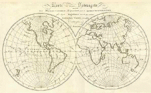
After extensive searching, I have located an isoline map of significance. Historical and national significance, at that. Norwigian scientist Christopher Hansteen was honored by his native land with a stamp commemorating his pioneering work toward mapping the earth's magnetic fields.


Despite generalized lines, it is a very nice map that provokes thoughts, questions, and inevitable Googling.


The stamp is based on his etching:


The Nobel Prize is a big deal, but a stamp is immortality. It provides a more accessible legacy for the masses.