 |
| Oh what fun it is to re-build this darn map all nite! Oh, Jingle Bells... Jingle Bells... |
Thursday, December 25, 2014
Lab 10 aka "I Ain't Gonna Work On Mappin' Farms No More"
Thursday, December 11, 2014

Sunday, December 7, 2014
Fill 'er up!
The holiday season has provided us with some of the lowest prices in months... years. In celebration, here's a proportional symbol map that shows an interesting pattern in pricing for Maryland residents.

Sunday, November 30, 2014
Hard Times and Easy Livin'
This multivariate map is part of a story from the New York Times in late June 2014. It appears to have been researched and consolidates multiple varibles into a bi(better or worse)-variate map describing the socio-economic health of our nation. The Upshot blog features some insghts from the story, data, and map.
http://www.nytimes.com/2014/06/26/upshot/where-are-the-hardest-places-to-live-in-the-us.html?_r=2&abt=0002&abg=0
The author(s) selected multiple factors to determine habitability and then distilled what mattered into a easily digestable graphic. (a rare treat) Regardless of whether the research or methodology is botched, coherent and effective representation is very challengeing. This is a fine product. Most of the other bivariate maps I found were boring, ugly, improperly used, or inappropriate for the theme and data. This map aligns perfectly with the concept and desired message. While it is likely many of the data sets had limited granularity, census block level data would improve the relevence and accuracy of the map. An additional description of the top factors that determine rank should be included for the reader. Furthermore, a breakout feature to immediately spotlight the best and worst counties could make the map more complete. I have yet to double check ColorBrewer for printability and visual issues, but I find the color scheme appealing.
http://www.nytimes.com/2014/06/26/upshot/where-are-the-hardest-places-to-live-in-the-us.html?_r=2&abt=0002&abg=0
 |
| Only Connecticut, Hawaii, and Wyoming are filled entirely with blue. No single state is entirely orange, but three states in the South (Louisiana, Mississippi, and West Virginia) do not contain a single county colored deepest blue. While the map has an interactive element, it tells its story well as a static map. |
The author(s) selected multiple factors to determine habitability and then distilled what mattered into a easily digestable graphic. (a rare treat) Regardless of whether the research or methodology is botched, coherent and effective representation is very challengeing. This is a fine product. Most of the other bivariate maps I found were boring, ugly, improperly used, or inappropriate for the theme and data. This map aligns perfectly with the concept and desired message. While it is likely many of the data sets had limited granularity, census block level data would improve the relevence and accuracy of the map. An additional description of the top factors that determine rank should be included for the reader. Furthermore, a breakout feature to immediately spotlight the best and worst counties could make the map more complete. I have yet to double check ColorBrewer for printability and visual issues, but I find the color scheme appealing.
I am your density.
Maybe you are what you eat. This restaurant's national distribution seems to define our shape.
I don't buy in to all the Super-Sized bashing of convenient targets when it mostly boils down to making (or having the opportunity to make) good choices and the (dreaded) personal responsibility. Don't try to make a silk purse out of a sow's ear. Let traditional fast food do what it has done for decades. If "MacDowell's" started serving the absolute tastiest and healthiest organic and vegan burgers, wouldn't everyone be just a little skeptical? (Soylent Green?) New vendors of healthy fast foods should be supported in the market as alternatives to the same ole stuff. But this coversation digresses quickly due to capital, power, demand, etc and is not the point of this blog... BUT, while there may be some room for cartographic improvement, this map certainly makes a statement. Compare and contrast with a previous blog entry. Bon Appetit!
 |
| I don't know about you, but my eye caught a curious absence of dots in the general shape & location of West Virginia. Are all of their locations on or near the state border? What is the design or method of the dispersion? Tell me, Mr. Von Worley: Why do the dots glow? |
I don't buy in to all the Super-Sized bashing of convenient targets when it mostly boils down to making (or having the opportunity to make) good choices and the (dreaded) personal responsibility. Don't try to make a silk purse out of a sow's ear. Let traditional fast food do what it has done for decades. If "MacDowell's" started serving the absolute tastiest and healthiest organic and vegan burgers, wouldn't everyone be just a little skeptical? (Soylent Green?) New vendors of healthy fast foods should be supported in the market as alternatives to the same ole stuff. But this coversation digresses quickly due to capital, power, demand, etc and is not the point of this blog... BUT, while there may be some room for cartographic improvement, this map certainly makes a statement. Compare and contrast with a previous blog entry. Bon Appetit!
Turkey Time!
Happy Holidays! Here's hoping you all navigate your way through Thanksgiving dinner with ease.

Isoline Map Stamp
After extensive searching, I have located an isoline map of significance. Historical and national significance, at that. Norwigian scientist Christopher Hansteen was honored by his native land with a stamp commemorating his pioneering work toward mapping the earth's magnetic fields.
Despite generalized lines, it is a very nice map that provokes thoughts, questions, and inevitable Googling.

The Nobel Prize is a big deal, but a stamp is immortality. It provides a more accessible legacy for the masses.
Monday, November 24, 2014
How apropos!
I am not a fan of propotional symbol maps. This is by far the best one I have ever seen.
From Russia with love:
From Russia with love:
 |
| I have not located an english translation. Beautiful work with wheels, steps, and dots. Visual balance in color and space. |
Color Me Amused
Color, tone, hue, shading. it's all here! Inset maps- check! Compass rose- check! Sea monsters-check!
The map IS the adventure.
 |
| Notice the northeast position of the sun. It also appears to be a relief map. Gorgeous and fun! |
Sunday, November 23, 2014
Chloropleth Map
Yes, it is Choropleth. C-H-O-R-O-pleth, not like chlorine, chlorophyll, or chloro fluoro carbons.

BUT, I have found a Chloro Choro Carto. Behold!:
It is actually pretty. Pretty awful. Nice color scheme- what does it mean? What do the dots mean? Is there significance to their location? Are those lakes or new countries in Scandinavia? There is a separate page to download for some explaination. That's fine, but there is plenty of room for a color ramp legend. Cartographic nuance and fundamental elements are missing. Must have been a short production deadline.
And , Yes, the assignment is to find a great example. I like this one:
http://www.scientificamerican.com/article/americans-get-fatter-drunker/
 |
| The line graph and net change comparison features are what set this map apart from others in this genre. Impressive communication of concept and storytelling. |
Campus Maps
Better late than never... I am overcompensating with four maps.
Great schools have bad maps. Some great schools with renowned geography programs have bad maps. So much for the marketing tool there. That has made for an unexpectedly long search. And much to my disappointment, no single map has wowed me. May I present the following maps with unique elements and virtues of their own that should be recognized and translated into the cartography of other institutions ASAP!
First we have the University of Iowa, circa 1943:
It knows its job and does it well. Some more landmarks and labeling would help me miss the scale bar less.
Next, Williams College appreciates mapping more as an art, less of a science. Why do they also seem to ignore scale? (Probably to make a pretty map that shows an area of interest entirely) The map is visually appealing, has an heirloom quality, and is very navigable with clearly drawn streets and labels.
Meanwhile, West Texas A&M provides a nice artistic rendering overlain upon recessive b/w aerial imagery of the campus. Art AND science. You have a real geographic area connected to the school map- georeference! Major highways are labeled. Building numbers are easy to identify in the corresponding legend. Unfortunately this static map is not the version made available for download.
Finally, I am compelled to include an interactive map from The Ohio State University as bonus material. It shows change over time with the growth of the campus in selected map years. It still tells a good story as a series of static maps. Well Done.
Great schools have bad maps. Some great schools with renowned geography programs have bad maps. So much for the marketing tool there. That has made for an unexpectedly long search. And much to my disappointment, no single map has wowed me. May I present the following maps with unique elements and virtues of their own that should be recognized and translated into the cartography of other institutions ASAP!
First we have the University of Iowa, circa 1943:
 |
| Done as a service to locals and visitors from a fraternity chapter. Marketing! Whenever I hear "University of Iowa", this map will be my first thought... immediately followed by, "Great map archive!". http://digital.lib.uiowa.edu/maps/ |
It knows its job and does it well. Some more landmarks and labeling would help me miss the scale bar less.
Next, Williams College appreciates mapping more as an art, less of a science. Why do they also seem to ignore scale? (Probably to make a pretty map that shows an area of interest entirely) The map is visually appealing, has an heirloom quality, and is very navigable with clearly drawn streets and labels.
 |
| Attention to detail makes architecture, landscape, and direction easily recognizable. The reader can quickly match the environment to what is drawn. http://www.williams.edu/files/williams_map.jpg |
Meanwhile, West Texas A&M provides a nice artistic rendering overlain upon recessive b/w aerial imagery of the campus. Art AND science. You have a real geographic area connected to the school map- georeference! Major highways are labeled. Building numbers are easy to identify in the corresponding legend. Unfortunately this static map is not the version made available for download.
 |
| Connecting the abstract to reality is this strongest component of this map. The insets are awkward, but it is very readable. |
 |
| From tiny acorns... |
 |
| Notice how the horseshoe stadium is a big red O- Marketing! |
Tuesday, November 11, 2014

Tuesday, November 4, 2014
Final Project Time!
After making reasonable searches of the internet, I have decided to make a DC Music Map. None can be readily found or downloaded for free. This map project allows me to learn more about music culture and history in the metropolitan area while I create a helpful guide for music enthusiasts, tourists, and dcists.
This will be a simple, easy to read reference map with distinct symbology for venues, statues, parks, and various points of interest regarding the history of the DC music scene past and present. Preliminary research indicates that limiting the scope to the District of Columbia provides plenty of sites within a concentrated range. Extending the geography to Virginia or Maryland may reduce the novelty and appeal of the map subject.
Data will be primarily from the internet. At present, there are no anticipated difficulties in acquiring or manipulating data. In-person verification and validation (ground-truthing) of some locations may be required to ensure the utility and positive reception of the map. A simplified street map will serve as the base map. Map background and supplemental features will be determined once the primary map features coalesce.
Production Schedule:
Week 1: Research DC music history, create table of important figures and places, trim list to 30 points or less. Verify any questionable locations; get addresses and coordinates if GIS is incorporated now or in future. Indicate if some venues are seasonal.
Week 2(ongoing): Design and layout- Determine appropriate street base map, color scheme, symbology. Note potential time to complete a tour. Categorize points of interest. Use weekly class feedback toward updates and revisions. Place paths. How connected are the sites? Is the rough draft map readable?
Week 3: Is the draft map functionally accurate at this stage. Could anyone navigate the sites easily? Add background. Determine peripheral cartographic elements.
Week 4: Critical week for feedback should be close to final product with due date and last presentations approaching. Shop the map; ask colleagues and students outside the program about quality, utility, stupidity, etc.
Week 5: Scrutinize for opportunities to add nuance and professional touches. Look for the little things, unless big things are not finalized. Finalize big things. Listen to classmates’ critiques for perspective, last minute catches on what I’ve seen for weeks, and future adjustments.
Week 6: Sweet relief! Winter Break.
Anticipated Challenges (as of 11/4/14)- Determine if this will be a walking tour-multiple days/ stages/route/seasonal factors, number of places too few/too many, how to communicate significance simply, attracting interest from general audience, accessibility, safety. Make it colorblind friendly, ease of digital/paper transfer betweeen media. This list will expand as necessary.
Map Examples- The Good, The Bad, and ¡Uy que feo!
Thursday, September 25, 2014

Monday, September 22, 2014
The Shape and Form of Letters
This week we are tasked with finding a intriguing typography example.

Wow. Cartography is not a dying art.
From http://store.axismaps.com/ Here's their story- http://axismaps.com/company.php
Wow. Cartography is not a dying art.
From http://store.axismaps.com/ Here's their story- http://axismaps.com/company.php
Graticule Grati2d
Thank you, Karl Mollweide. Without you, I would have never met the Illustrator Transform pain pane. Its elegance, like your projection, is understated.

Projection Foolishness
As the mnemonic goes: Projections make Cartographers SADD.
But, I found two happy little distortions:
 Is the Polyconic Projection joyous because it listens to the Polyphonic Spree?

Hammertime! This projection is interactive... elsewhere.
Follow this link- http://www.jasondavies.com/maps/hammer-retroazimuthal/
Both examples from GIS Lounge April 1st, 2013.
But, I found two happy little distortions:
The Hammer Retroazimuthal Projection
Hammertime! This projection is interactive... elsewhere.
Follow this link- http://www.jasondavies.com/maps/hammer-retroazimuthal/
Both examples from GIS Lounge April 1st, 2013.
Thursday, September 11, 2014

Thursday, September 4, 2014
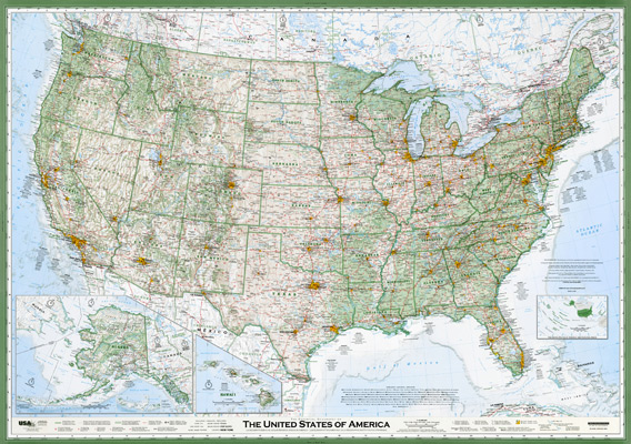
The Greatest Paper Map of the US Ever
... or something like that according to this Slate article. David Imus spent 6,000 hours designing this award-winning map. It is utterly amazing, but not flawless. Hoping this is harder than our future homework assignments.
Thursday, August 28, 2014
Welcome
Thanks for visiting Melanie's Maps.
This blog is primarily a collection of my classwork for GGS310 at George Mason University.
You will also find some Geography News, Tech Tips, and Geocentric Links. And some cheeky comments from my classmates and professor.
Stay tuned for my post of Assignment 1: The Static Map That Changed My Life.
Cheers,
Melanie
Subscribe to:
Comments (Atom)